

Interior Colour Trends Set to Take 2021 by Storm
What interior colour trends are new for 2021?
A number of major home improvement paint companies and producers of colour palettes like Pantone are now making their predictions for the coming year. 2020 has been a year like no other with restrictions and lockdowns our homes have become our safe havens. In this unprecedented year we have all spent more time in our homes and gardens and have learnt to upgrade and treasure our safe spaces. Home improvement projects are on the increase both inside the home and in our garden spaces. 2021 will see the rise of colour trends that group similar tones and enable contrasts with other colour palettes to connect with our natural environment, create nostalgia and harmony in our homes.
Pantone
Pantone has launched Summer Bouquet, Intoxicating and Power Surge as the colours for 2021 from their textiles range. Summer Bouquet combines pale hazy petals with exotic pinks and herbal green, a fresh floral palette celebrating the positivity and happiness of natural colours. Intoxicating combines vibrant yellows, lavender and fragrant pink with cool greens to create a dynamic contrast with creamy whites to add freshness. Power surge a palette of bright vibrant shades of pinks,violets and lime to create vivid contrasts.
Dulux
Dulux have announced Retreat, Nourish and Reset as their interior colour trends for 2021. Nourish draws on nature and the need for comfort to create tranquil surrounds. These tones capture our recognition of the inherent beauty within natural colours creating our human bond to the natural world both soothing and calm. Deep luxurious greens such as Olive Blend enhance our emotions and can create continuity with our outdoor garden spaces.
Retreat draws on our feelings of being safe and comfortable within our home environment. With working from home the new business norm, most homes are now our workplaces with new activities and busy days to manage. What was once our place for relaxation is now a theatre embracing our families, work colleagues and social activities.
The bedroom is an ideal starting point to create your marque. Create tranquility by contrasting darker hues like Teahouse with a light and softer palette like Winter White. Reset promotes stronger bolder tones to lift interiors and energize your home. Colours like Hot Chilli, Treeless and Daintree.
The Dulux colour for 2021 is Brave Ground, a warm neutral colour that is comforting and grounding, it matches and compares stylishly with many other colour palettes. This colour and its harmonious tones are found in the NCS range around S4005 Y 20R and S4005 Y 50R. Bradite One Can can be matched to all these warm and neutral tones in a matt finish for your walls, doors and joinery for delivery next day.
Benjamin Moore has just announced that its 2021 colour of the year is Aegean Teal, an intriguing blue-green that creates natural harmony following a turbulent year. Following the same trend towards natural green colours.
Little Greene
Ruth Mottershead, creative director of Little Greene, forecasts there will be a drift away from greys to warm neutral colours such as Apple, Mushroom and Stone. These warmer neutral tones create relaxing living spaces that generate a more comfortable home. These neutral tones work extremely well as a base from which to introduce colour highlights on skirting boards, joinery and doors. Green is overtaking grey in popularity alongside lime tones.
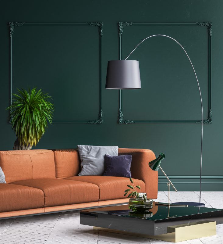
Limes and Green palettes are synonymous with nature and its calming qualities creating a contented home. From the rich dark greens to the light and invigorating lime greens, they can be used throughout your home to create a powerful restorative effect. Used in home offices green and lime colour palettes create a feeling of thoughtfulness and contemplation.
Farrow & Ball
Farrow and Balls colour expert Joa Studholme reconfirmed Green palettes reinforce our connectivity with nature and create the perfect introduction for visitors through your home. Bringing the forces of the natural environment into our interiors encompasses a feeling of embodiment as well as evoking calm. Green is consistently a favourite choice to breathe life into dining rooms and create a feeling of tranquility in bedrooms. Olive Green like RAL6011 can help create a serene environment and a relaxing outdoor feel in your home.
In these times of uncertainty as we have experienced in 2020 we regularly seek warmer tones that will enrich our homes and create sanctuaries away from the uncertainties outside. The trend away from cooler tones of blues and greys towards warmer palettes of reds and plums will continue in 2021. These rich warm tones are on trend by day and comforting by night bringing a luxurious atmosphere to our living spaces and bedrooms. Bold combinations with natural colours are another new trend with strong greens combined with rich berry colours to create dramatic, inviting and intimate interiors.
How do different colour trends drive our emotions?
There is a significant amount of colour psychology associated with home improvement paints. Generally colours in the red area of the spectrum are interpreted as warm colours including reds, yellows through to oranges. They can generate feelings of warmth as well as feelings of anger. Red has the longest wavelength making it a powerful colour, it has the perception of appearing nearer, demanding your attention. Many leading retailers use red tones in their corporate brand.
Yellow stimulates our emotions and is psychologically the strongest colour. It generates feelings of confidence and optimism. Orange is the combination of red and yellow that stimulates ideas and feelings of physical comfort. Yellow is a fun colour associated with food, warmth and homeliness.
Colours on the blue side of the colour spectrum are associated as cool colours they also include violets and greens. These colours are often associated with calm and healing. Blue is the colour of serene and calm a colour of clear communication. Green is positioned at the centre of the colour spectrum and is the colour of balance. We are all reassured by green on a natural level creating feelings of well-being.
Violet has the shortest wavelength on the colour spectrum.It is inward looking and generates thoughts of deep contemplation or meditation. Violet has regal associations and communicates fine quality. Grey is a colour with no direct psychological properties yet it remains one of the most popular colours in 2020.
White is purity, total reflection, combining the force of the spectrum into our view. Clean and hygienic, White gives a heightened perception of space. In contrast Black is all colours absorbed with an absence of light. It expresses absolute clarity, sophistication and perfection.
How can I compare and contrast colours?
The process of contrasting and comparing colours and their tones is the work of professionals, designers and artists. There are many articles in this field one of particular interest highlighting trends in 2021 is Pantone's 2021 forecast.
Combinations are continually changing with fashion and trends. These combinations vary for the interior and exterior of our homes. Selections from neighbouring colours in the colour sphere are known as harmonious. They work well together to connect adjoining spaces. Limes and greens work particularly well connecting indoor and outdoor spaces. Tonal schemes that use light and dark tones of the same colour appear seamless. A popular interior tonal scheme on trend in 2021 is Sea Green 217 and Eau de Nil 216.
Bradite One Can is recommended for your interior home improvement projects for walls, joinery, masonry and UPVC windows. It can be applied internally and externally throughout your home with no odours. No primers are required, it is fast drying enabling two coats to be applied within an hour. Over 2000 colours are available for free next day delivery direct to your home. Colour selection is unlimited...
see more style advice on our instagram page