Colour Selection, Combinations, And Palettes in 2020
How are colours Defined and Compared?
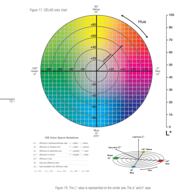
Developed in 1976 the CIE Lab colour space was created to establish a universal system to compare tones. Hue is measured moving around the circumference of the colour sphere through red, yellow, blue, and green. The Chroma defines the vividness, increasing from the centre to the circumference. They can then be measured and positioned numerically using three values. The A axis positions colours numerically on the green/red spectrum. The B axis positions colours numerically on the yellow/blue spectrum. The L value measures colours for their lightness and darkness. The difference between two colours Lab values is called the Delta E, and can be measured precisely. This mathematical calculation forms the basis of comparing all colours. The paint industry considers a good match to have a Delta E value of less than one.

Colour Spectrum Measurement
Which are the most popular Standards & Ranges?
Standards in general were developed for local markets and most regions have their own standards and preferences. With the globalisation of paint markets European and global standards have emerged. In the UK two local ranges are common, BS4800 which is a range of decorative colours for the home improvement market and BS381c for the military and safety identification colours. There are around 300 distinct British Standard colours.
In Scandinavia the most popular range is NCS, the Natural Colour System. The NCS system utilises six elementary tones white, black, yellow, blue, red and green. Each shade has increasing vividness or chroma producing in total 1950 unique shades within the range. The Dulux colour dimensions range is based on the NCS system.
In the USA the most popular range is Pantone which contains over 1700 shades. It is available in two forms the u- uncoated range which are matt and the c-coated range which are glossier. There is a slight variation in tone between the coated and uncoated ranges, the uncoated generally is lighter. Pantone is the leading global range for graphic designers.
In Germany a number of ranges have emerged. RAL Effect is a collection of 420 water-based colours including 70 metallics. For the manufacturing industry the RAL Classic is the preferred range, consisting of 199 solid colours, four luminous and ten pearlescents. Interestingly, to qualify, the shades must be of superior interest and not subject to fashion trends! As colour choice is so often subject to the ebbs and flows of fashion, it is not surprising that a new range has been introduced - RAL Design. It follows the CIELab system and has 1625 colours in the range, it is popular with architects. Globally the most used range is RAL Classic. From a design perspective RAL Design, NCS and Pantone are the more creative ranges.
Although these represent the main global ranges, there are still new ranges being launched by bespoke paint providers like Zoffany, Little Greene Paint, Farrow & Ball. They are company led selections designed to be distinctive and create trends. All these ranges can be measured using CIELab and colour matched accurately. Many of the Farrow & Ball shades are available from Avace.
What are the emotions that drive colour selection?
There is a great deal of psychology associated with colours. Generally tones in the red area of the spectrum are known as warm, and include reds, yellows and oranges. They can evoke feelings of warmth and feelings of anger. Red has the longest wavelength it is a powerful colour with the property of appearing nearer, demanding attention. Many leading retailers use a tone of red to brand their business. Yellow stimulates emotion and is the strongest psychologically. It is associated with confidence and optimism. Orange is a combination of red and yellow it focuses our minds towards physical comfort. Yellow is associated with fun, food, warmth and homeliness.
On the blue side of the spectrum, tones are considered as 'cool' and include violet and green. They are often described as calming and soothing. Blue is serene and calm, and very often associated with clear communication. Research shows blue is most popular worldwide. Pantone Classic Blue was chosen as colour of the year for 2020. Green is the centre of the spectrum and represents balance, we are reassured by green on a primitive level. Dulux announced Tranquil Dawn, a tone of green, as their colour for 2020 nurturing feelings of wellbeing and positive interactions. Violet is the shortest wavelength on the spectrum. It is introvert and encourages deep contemplation and meditation. Violet has associations with royalty and usually communicates the finest possible quality. Grey is the only shade with no direct psychological properties yet it remains one of the most popular choices in a wide range of applications. Anthracite grey (the famous RAL7016) is the most widely specified colour for windows, doors and building fabrications in the UK. White is total reflection, reflecting the combined force of the spectrum into our eyes. White is purity, clean and hygienic. White gives a heightened perception of space. Black is all colours absorbed, it is essentially an absence of light. It communicates absolute clarity, sophistication and uncompromising excellence.
Comparing and Contrasting
The process of comparing and contrasting different tones is the work of professionals, designers and artists. There are many articles in this field one of particular interest can be found here
Combinations are fashionable and trends are continually changing. They vary for the interior and exterior of homes. For the long term protection of exterior wood Demidekk Ultimate is preferred by architects with 12 years protection. For decking paints, fencing and siding on houses grey exterior wood paints are chic and timeless. Paired with creams and lemons they create a feeling of style and relaxation. Harmonious schemes with selections from neighbouring tones in the colour sphere work well to create connections between adjoining spaces. Demidekk Ultimate Limes and greens work particularly well in the garden for wooden furniture, fencing and summer houses. You can select your preferred brand of exterior wood paint in any of these colour palettes.
For masonry paints our survey found 50% of householders prefer exterior house paint selected from white to cream tones especially for cottages and countryside homes. The next most popular tones are pale blues, shades of yellow, mint green, lilac, terracotta, navy blue and grey. Bradite One Can is the recommended paint for masonry and brickwork. Applied direct to brickwork no primers are required. Two coats can be applied within an hour. Over 2000 RAL, BS, and NCS colours are available for free next day home delivery. Select a seamless tonal scheme that uses light and dark tones of the same colours. This is recommended for Bradite One Can on walls and facades - using Bradite One Can dark tones like anthracite grey RAL7016 creates a bold statement for the main brickwork paints with lighter tones of grey for alcoves and entrances. Bradite One Can is the ideal home improvement paint for exterior masonry and brickwork. For advice and information on palettes for masonry paints take a look at our Bradite One Can page.
This is the first in a series of articles relating to colour, hopefully providing background knowledge of availability, emotions, and ideal combinations will help design your home and garden. We will continue to explore and communicate the developing trends and products for interior and exterior home improvements.
Avace has provided paints and powder-coatings to a range of homes, industries, and businesses since 2008. We have decades of experience amongst our ranks and are well placed to help you with any requirement you may have for paints. We pride ourselves on our level of customer service, handling each order personally and professionally.

