

Little Greene Hicks Blue Inspiring Combinations for Bathrooms
Little Greene Hicks Blue Inspiring Combinations for Bathrooms
Little Greene in Collaboration with The National Trust
Little Greene Paint and Paper follows 300 years of decorative history throughout the key periods of interior design since the 17th Century. Little Greene has worked closely with the National Trust.
who have over 500 buildings in their care, including some of the finest and most prestigious historic properties in the UK. Since 2018 in collaboration with their conservators and curators, an extensive research project has been undertaken in National Trust houses and gardens to find unique colours and to explore the stories of the characters who first enjoyed them.
The Colours of England range has been inspired by these most important historic interiors and landscapes. Rediscover the colours of the nation's heritage with a stunning, contemporary twist.
Little Greene Hicks Blue -Inspiring Colour Combinations
Blue is the colour of serene and calm, it is a colour of clear communication. Colours like Little Greene Hicks Blue are chosen for their tranquil qualities, particularly for bedrooms and bathrooms.
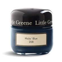
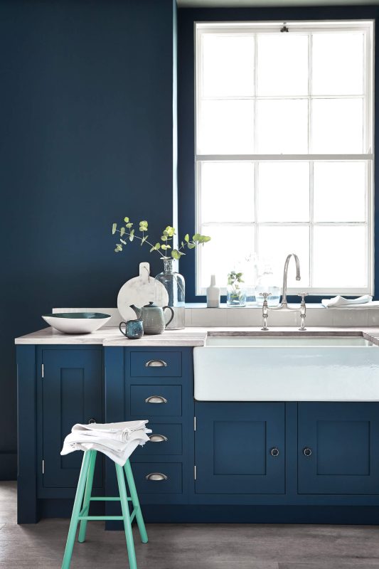 Little Greene Hicks Blue (208) makes a great combination with Obscura (327), Dorchester Pink (213) and James (108). This colour was made by David Hicks, he was one of the most important designers in the 60s and 70s, he used powerful colours in combination to dramatic effect. Besides domestic projects for English aristocracy, Hicks also worked on many commercial projects and used this blue in the restaurant at the top of the London Telecom Tower in 1962.
Obscura is an elegant, gentle blue-grey which sits effortlessly in the tail of the Gauze Colour Scales family. Equally elegant, used in solitude as among the lighter Gauze shades, this cool neutral works beautifully with Hicks Blue Absolute Emulsions, and natural flooring textures like sisal, coir and jute.
A 1960s article on an interior in the Dorchester Hotel describes the use of the Dorchester Pink as a contrasting colour: Lilac alongside blue provides an unusually restful setting a bedroom.
Little Greene James is a pretty powder blue alternate, warmer than many blues by the inclusion of white and violet. It provides balanced contrast with Hicks Blue and is also classically paired with French Grey Mid (162), Pale Lupin (278) and Arquerite (250).
Alternatively, bring warmth to a room with a hint of green such as Little Greene Canton (94) for a bold finish. For a softer look, try a lighter shade of blue like Little Greene Bone China Blue (107) and combine with slight tonal shift to Bone China Blue Faint (325) or Bone China Blue Pale (182) from the Colour Scales family. Alternatively combine with Little Greene Basalt (221), Knightsbridge (215) or Thai Sapphire (116) for a bold contrast.
Also, utilise blue hues such as Little Greene Etruria (326), it is a classic colour inspired by the work of renowned potter Josiah Wedgwood who named his Staffordshire ceramic factory 'Etruria' in 1769. The title was a tribute to his passion for the forms, colours and decoration of ancient Etruscan and Greek pottery, which he expertly recreated and brought to English high society in the late-18th century.
Little Greene Woad (251) a popular blue pigment used to dye fabrics in medieval times, woad is a plant extract that produces a charming muted-indigo quality. A perfect backdrop to gilded picture frames pairs beautifully with Little Greene Urbane Grey.
Little Greene Matt Emulsions Rich & Luxurious Colour, High Coverage Rates, Child Safe.
 Absolute Matt Emulsion is a beautiful sublime chalky dead 3% matt finish which exudes style. It is easy to apply with high coverages rates producing an easy clean finish which is wipeable with a moist sponge. Absolute Matts chalky appearance makes it an ideal choice for walls, ceilings, plaster and lining paper in living rooms, bedrooms, studies and bathrooms.
This fast-drying finish is odourless, low in VOCs, child safe and an environmentally compliant decorative paint. Available in 1lt, 2.5lt and 5lt packs across the full Little Greene Colour palette.
Intelligent Satinwood is an ultra-tough low maintenance, low sheen finish, that is easy to apply, quick drying and totally washable. It is suitable for all interior joinery, particularly kitchen cabinets, doors, skirting, windows and doors. It is odourless, stain resistant, child safe and with near zero VOCs environmentally compliant.
Intelligent Matt Emulsion is a hard wearing 5% matt finish that is fast drying and washable making it specifically designed for walls in high traffic areas such as kitchens, hallways, nurseries and open plan living spaces. It is 15 times more durable than ordinary matt emulsions and combines beautiful deep luxurious colour with a practical washable finish for decorating kitchen wall. Combined with Intelligent Satinwood on your interior woodwork and joinery, it will enable you to create practical colour combinations for a modern home with contemporary interior designs.
Intelligent Matt is odourless, stain resistant, child safe and environmentally compliant containing no harmful ingredients. It is available in 1lt, 2.5lt and 5lt packs in all of the Little Greene Colours of England. 60ml colour sample pots are also available to test your selected colours on the walls in your home.
Blue tones in Combination with Wallpapers
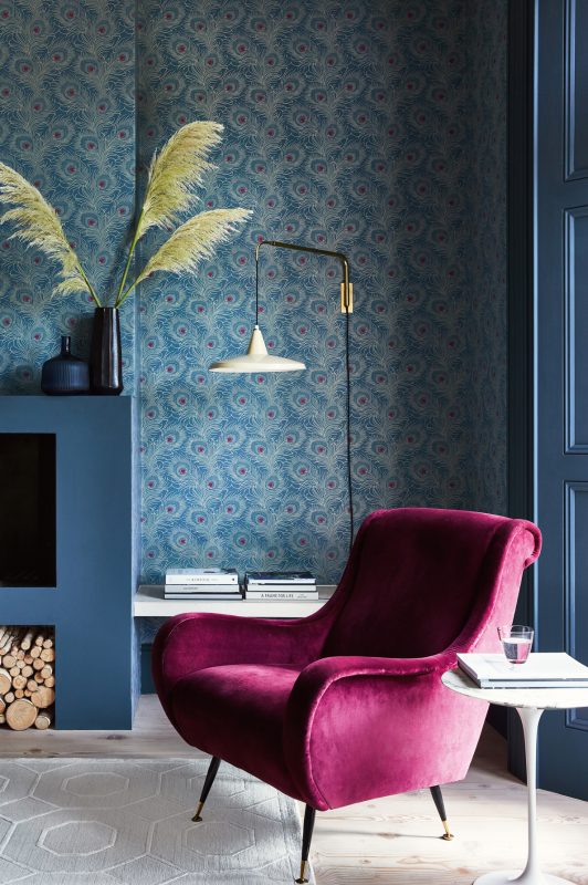 One of the easiest ways of pairing your Blue Tones with wallpaper is to use complementary shades or colours from the same part of the colour wheel, this creates a more cohesive and well-matched appearance in your living areas.
For a colour like Hicks Blue, it pairs beautifully with Carlton House Terrace Blue Plume which can help break up the Hicks' Blue colour, so your space does not become 'washed out'.
Hicks Blue also works well with Lavaliers Low Wave, because it has an excess of white in its design making the blue stand out and make the room feel complete.
Visit the Little Greene latest Showroom in Brierley Hill, West Midlands
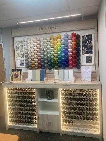 A new colour showroom has been opened by AVACE at its production facility in Brierley Hill, near the Merry Hill Centre. A unique space for colour inspiration with expert assistance from our professional staff who will help guide you through the Little Greene products.
The showroom displays all the Little Greene colours in varying light sources with a colour album that contains larger samples of each of the colours. Interior designers and paint contractors are welcome to spend time in our showroom using these tools and the National Trust Wallpapers to create great designs.
Our showroom exhibits luxury wallpaper designs that combine some of the most beautiful and timeless wallpaper patterns, each pattern is based on an original style that has been found in historic archives and recreated with subtle combinations of Little Greene Paints.
Free Colours of England and Colours Scales Cards
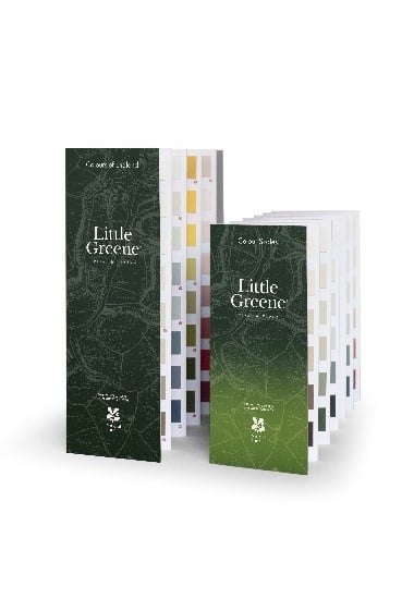 Little Greene Paints are showcased across two colour cards the Colours of England collection and Colour Scales.
You can order your complimentary Little Greene colour cards here, the range includes 128 Colours of England and 75 Colour Scale tones.
Visit www.avace.co.uk/little-greene/ to view the colour palettes online. Each colour palette contains similar and contrasting colour combinations. Click on each colour for information on best combinations, product availability, pack size and price. Once you have selected your preferred colours, simply order any number of 60ml sample pots to try out your colours in your home environment. Delivery is free next day when you order three or more pots. Please note the sample pots are for colour selection only and based on Absolute Matt, they may not exhibit the properties of your final choice of paint.
Inspirational Colours
For inspiration on the latest colour trends and ecological paints follow avacedesign on Instagram.
![]()