
For all orders over £15
Free Shipping
Architectural deep, saturated colours are a key tool in modern architectural design, enabling designers to shape atmosphere, influence behaviour, and define spatial identity. Whether applied in public buildings or private residences, deep hues can transform interiors—introducing sophistication, warmth, and visual depth.
When used strategically, these tones help create zoning, enhance material finishes, and elevate the overall user experience.
Jewel-Toned Greens in Interior Design
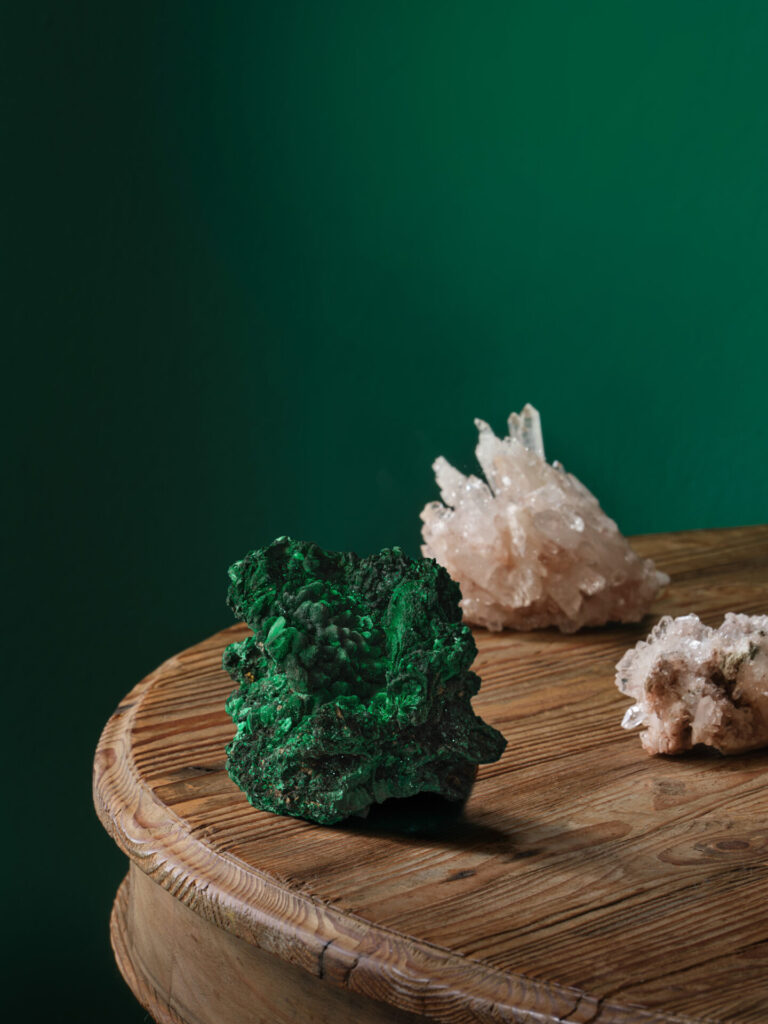
Green is one of the most adaptable colours in architectural schemes, offering a balance between calmness and energy. Its connection to nature makes it particularly effective in environments where wellbeing and comfort are priorities.
Darker greens are ideal for:
Pairing deep greens with natural materials such as timber, marble, or aged brass enhances their organic quality and aligns with biophilic design principles.
Using Deep Reds for Warmth and Luxury
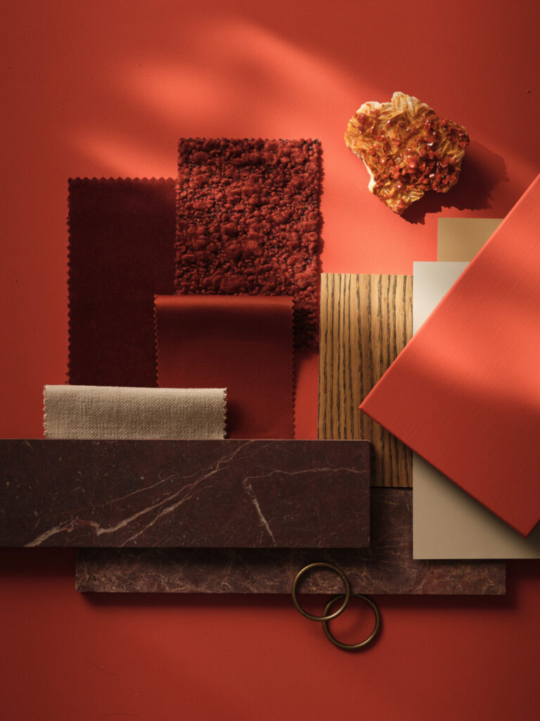
Dark reds have long been associated with opulence and are highly effective in creating intimate, inviting environments.
They work particularly well in:
For balance, opt for reds with earthy undertones and combine them with warm neutrals like taupe, clay, or soft beige. This prevents schemes from feeling overly intense while maintaining depth.
Lighting is critical—ensure sufficient illumination to prevent the colour from appearing too heavy.
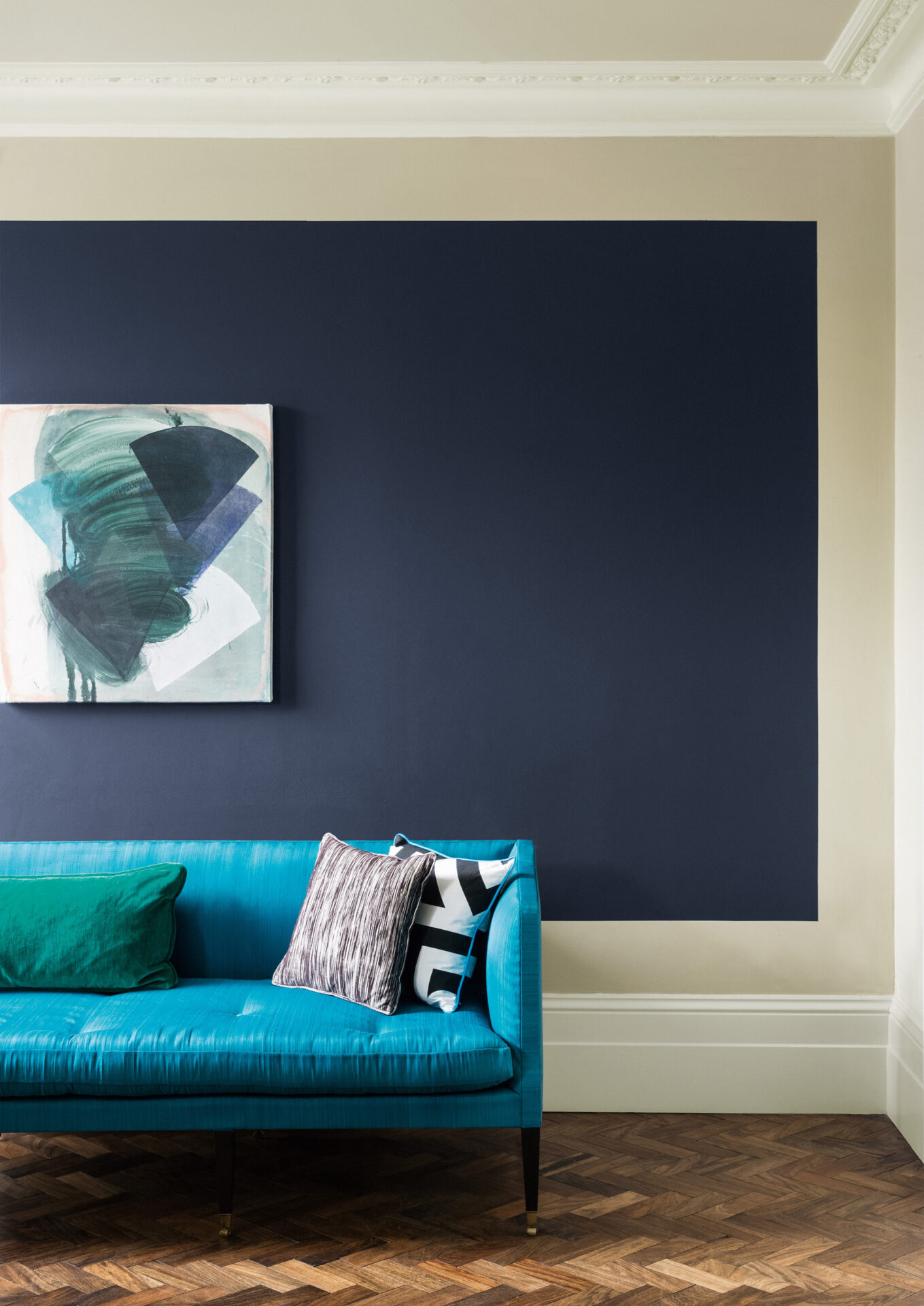
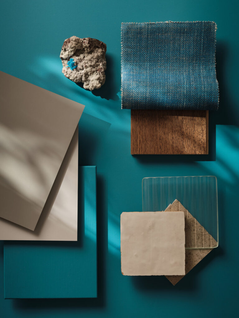
Midnight Blues for Depth and Sophistication
Midnight blues and deep navy tones offer a refined alternative to black, delivering depth without closing down a space.
Best applications include:
These tones perform particularly well in low-light environments, where they reduce glare and create a cocooning effect. Pair with lighter accents or metallic finishes for contrast and clarity.
Key Design Considerations
To successfully incorporate deep hues into architectural projects:
Practical Application Example
In a hotel or commercial reception area, combining deep green wall finishes with warm timber flooring and brass detailing can create an immediate sense of luxury. Extending the palette into adjacent spaces using deep blues ensures visual continuity while subtly guiding movement.