
For all orders over £15
Free Shipping
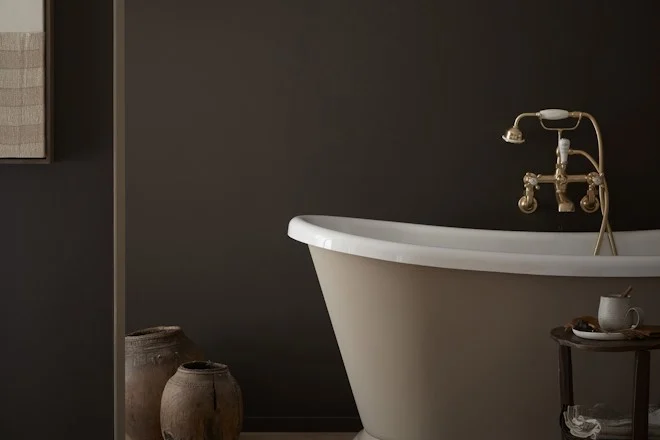
Dark colours have traditionally been associated with making a room look smaller than it is, but earthy undertones can create a space that feels more comforting than crowded. Rich chocolate browns and charcoal hues will add character to your living space, so we recommend using these sumptuous hues on walls and woodwork to create a naturalistic environment.
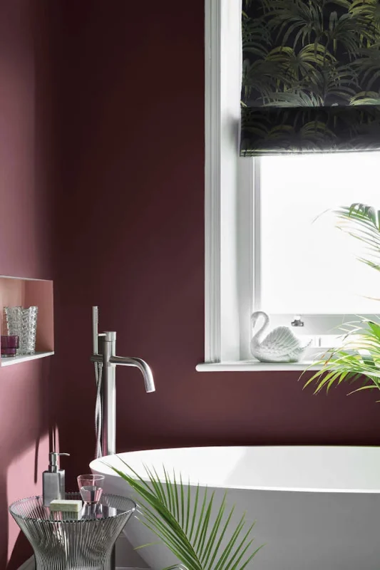
These colours can also be used to create intimate and restful settings, in bathrooms especially. To create a truly serene environment, pair these colours with interior decorations such as candles and greenery. Spa’s use this decorative combination to create a cocoon effect for visitors, as it’s almost like a warm hug from the overall aesthetic of the treatment room.
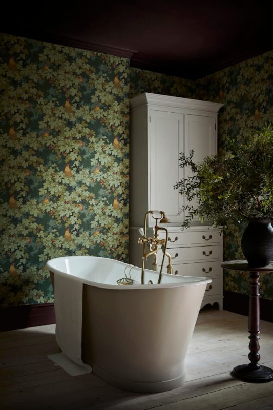
Vine (c1932), taken from the archive at the Whitworth Art Gallery in Manchester, offers an unmistakable nod to William Morris, the father of the late 19th Century Arts & Crafts movement. An authentic surface print technique has been employed to reproduce this contemporary version, with the blue colourway being very close to the original in colour – despite the poor condition of the background colour on the surviving fragment.
Pairing the wallpaper with some of the darker Little Greene colours, produces a spectrum of autumnal decorative ideas. As we are entering the cosy months of the year; darker nights, pumpkin spiced latte’s, halloween and nights in front of the fire, interior trends lean towards the darker side.