
For all orders over £15
Free Shipping
Which colour trends are coming back to make 1980s interior design style unique?
The 1980s were all about colour confidence. Interiors from this decade celebrated bold hues, chintz fabrics, reflective surfaces, and expressive patterns — a style known as maximalism. Today, many designers are drawing on this era for inspiration, using its rich colours in a softer, more refined way to create homes that feel both nostalgic and modern.
Which 1980s colours are back in style?
Designers are reintroducing moody teals, playful pinks, dreamy purples, and mint greens into interiors. These shades, once seen as dated, are now used to add warmth, grounding tones, and personality to today’s living spaces. Subtle, muted versions of these hues help create a modern look while retaining their retro charm.
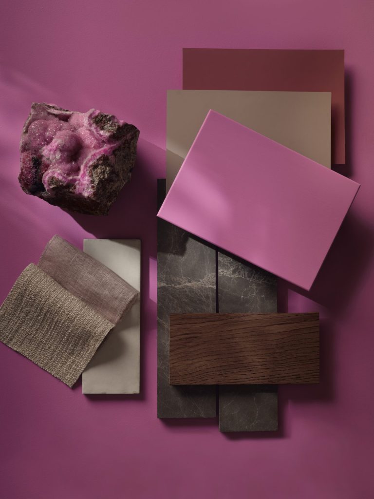
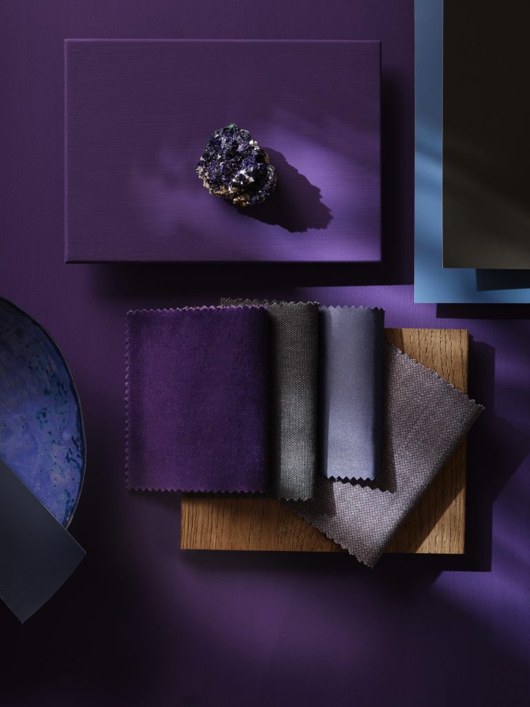
How can I decorate with purple in a modern home?
Purple was a big part of 1980s interiors and is now returning as a sophisticated accent colour. Use colours like Adventurer on a feature wall or in alcoves alongside neutral tones like Beauvais Lilac and blue Etruria trim for a contemporary twist. Deep plum shades can feel romantic, while pairing purple with warm pastels and touches of blue joinery creates a peaceful, layered atmosphere.
Is Pink still a good choice for interiors?
Absolutely. Pink — often associated with fun and playfulness — has regained popularity, especially in light of the “Barbie” trend. When used thoughtfully, it can look grown-up and chic. Designer Michelle Gage used a heliotrope pink wallpaper in a home office to create an energizing space. Pink pairs beautifully with greens and blues and works well in both contemporary and eclectic settings.
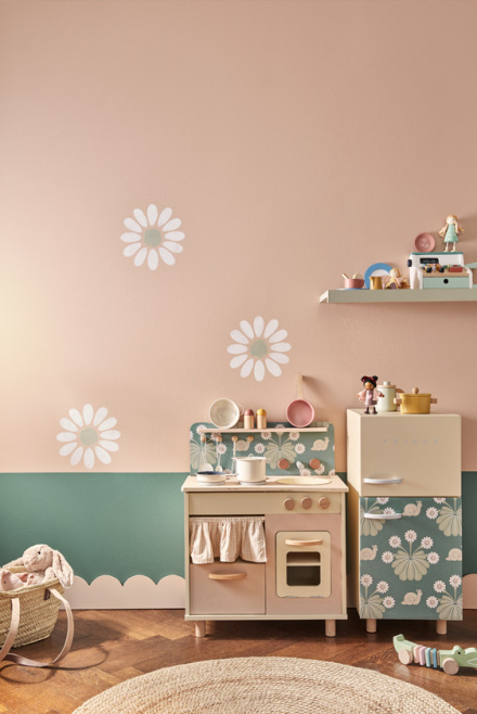
Why choose Mint Green for your home?
Mint Green was a signature hue of the ‘80s, and it’s now making a fresh return. It’s a great choice for bedrooms or bathrooms because it feels light, airy, and calming. To avoid a dated look, pair Aquamarine with crisp whites like Aquamarine Pale , woven textures, and tailored upholstery — creating a balanced and serene vibe.
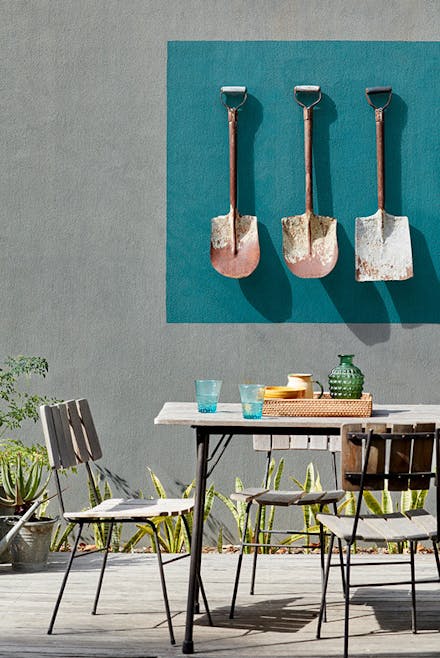
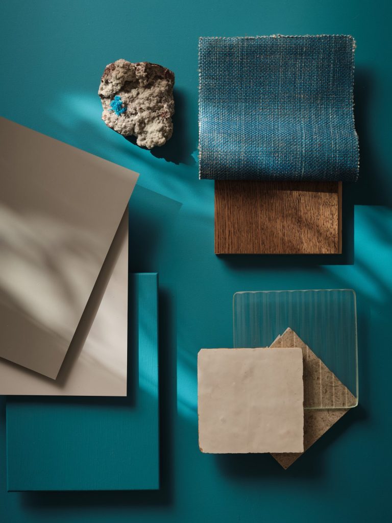
What about Teal — how can I use it effectively?
Teal was another hero shade of the 1980s and is being reinterpreted today in a more muted, sophisticated way, with versions like Canton. Whether used on cabinetry or as a wall colour, Teal adds depth and elegance to interiors without overpowering the space.
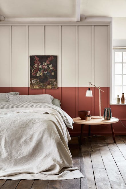
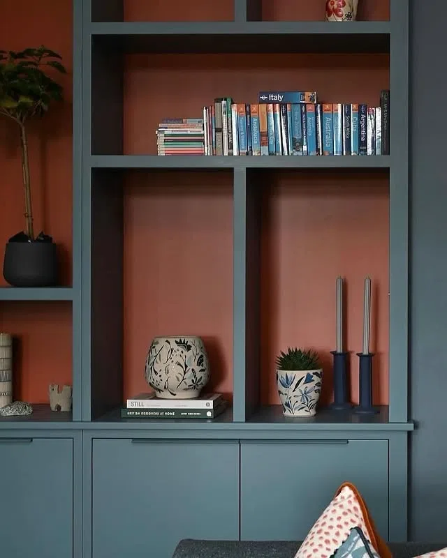
What is Tuscan Red, and why do designers love it?
Tuscan Red and its compatriot Blush, are earthy pastels inspired by terracotta tones, offering a neutral take on the ‘80s palette. It adds warmth to modern spaces while reflecting a retro character. These colours work especially well in bathrooms or living areas, balancing softness with substance.
How do I bring 1980s colours into a modern home without overdoing it?
The secret is balance. Choose slightly subdued versions of your favourite 1980s shades — think dusty pink Masquerade instead of hot pink, or teal with grey undertones like Aquamarine Deep. Combine these with natural materials like wood and rattan to ground the look. This approach keeps your design warm, inviting, and liveable rather than overwhelming.